A single, universal content management system (CMS) allowing NBCUniversal teams to build web experiences faster and more efficiently by using the same core components for various streaming services with territories across America, Europe, and Africa.
NBCUniversal CMS
Overview
NBCUniversal Content Management System (CMS), or better known as Iceberg is an internal tool for teams to build landing pages quickly and efficiently.
NBCUniversal was looking to standarize and streamline content creation processes across multiple brands. We wanted to optimize the experience for internal users while maintaining a premium look and feel for our customers.
By introducing new building blocks and templates to Iceberg, the teams were able to be more productive, build landing pages quicker and more automatically, test more efficiently, and produce consistent looking experiences across domestic and international brands.
Role
Lead Product Designer
PeacockTV (America)
SkyShowtime (Europe)
Showmax (Sub-saharan Africa)
NowTV (Europe)
Brands & Territories
Teammates
Shank Raval, Young Sun, Khanh Lam, Josh Williams, Clarke Spinosa, Emily Hunt, June Ko, Asha Isaac
What did I do?
Lead UI/UX design and user flow
Conduct User Acceptance Testing (UAT) and define technology requirements
Discovery, research, and long-term planning to future-proof CMS platform
Create high-fidelity designs optimized for domestic and international markets
Prototyping, mockups, and data analysis
Issue
Problem 1. Just the tip of the Iceberg! Growing Pains
NBCUniversal was having trouble growing and maintaining their landing page experiences across all their different brands. As the company expanded internationally, a need for an intuitive CMS became essential. As many of these landing pages built via Iceberg are our customer’s first initial interaction with our brands - it was crucial to help our internal editors have better building blocks to create these starts of these acquisition moments.
Problem 2. There’s an Iceberg in the way! Limitations
The existing CMS had many limitations. It was difficult to navigate, had a steep learning curve, and made it challenging for non-designers to maintain consistent experiences. Our internal editors had a varying design skills. And with the lack of templates, it led to inconsistencies, hindering the premium feel we wanted to provide to our customer base. There was also many barriers in terms of how the landing pages could look. Many times, editors wanted to create something but was limited by what they could do in Iceberg. Even changing padding was a chore. And for brands like Showmax, where editors had to create 44 different variations of each landing page for all of their territories, this meant a lot of manual effort and a lot of time wasted.
Problem 3. The Ice is finally is melting! Testing Improvements
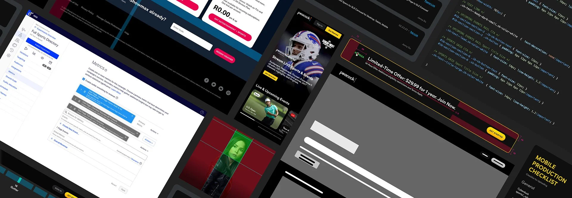
Teams creating landing pages wanted a way to quantitatively test their pages. They wanted to be able to improve conversion and click-thru rates but was met with difficulties in the existing CMS as it required coding knowledge and testing tools was not fully integrated in Iceberg. With improving the CMS, we could integrate Optimizely (a tool optimizely websites and applications via A/B and multivariate testing) into the different building blocks more seamlessly and allow users without coding knowledge to easily toggle on and off what they wanted to test.

CMS at Beginning

CMS Complexity

CMS Editor

CMS at End (Dream State)

CMS Backend Form

Template Picker
Discovery

Levelsetting & Roadmap
First, the design team worked with Product Managers from the New Paid Customers and Publishing Tools team to determine project scope, manage expectations, and determine success metrics. We worked together to establish a detailed roadmap, outlining the design and development phases, timelines, dependencies, and resource allocation.
It was crucial to prioritize minimum viable product (MVP) requirements while carefully considering post-MVP features. This approach allowed us to balance immediate needs with long-term goals while addressing the needs of both domestic and international markets. As the CMS was expected to be used across many different brands with a variety of different audiences, not only did we have to manage expectations within our internal domestic stakeholders, but also with our external international stakeholders. We had to levelset with our stakeholders, we couldn’t promise them everything under the blue sky, but we did want to make their lives easier.
Discovery
User Research
We conducted qualitative research within NBCUniversal, gathering learnings from various internal teams and analyzing survey results. Safe to say that they were not satisfied with their experience in the old CMS.

Competitive Analysis
Additionally, we explored external CMS platforms to understand best practices in content creation and management. We spoke with a variety of companies whose tools were focused on creating intuitive CMS experiences to better understand how to improve our own.
Data Analysis
With the help of the User Research team, we analyzed the data to identify key areas for improvement and so we could narrow down the necessary templates for MVP usage.
We also worked with the Publishing Tools team to conduct an audit on our existing signed out web experience across all brands to gather a baseline depicting the design inconsistencies throughout. This feedback was categorized into different buckets and friction points to help us determine next steps and guide our designs.

Video Player

Player Prototypes

Player Sizes & Variations

Player Specs
Plan
Beginning: Research & Inspo
The design and product teams kicked off the project by partnering to find the best areas for improvement within our internal CMS. Through our research and audits, we met weekly to discuss the key problems editors faced and prioritize the most needed templates. We aimed to get a clear picture of what worked and what didn't, so we could build a better experience for our editors and, ultimately, our customers.
Middle: Priority & Requirements
Building a unified system of building blocks and templates meant balancing the distinct branding of our diverse partners. The challenge was immediate: a solution that worked for PeacockTV in the United States was often incompatible with the needs of Showmax in Africa.
Our weekly meetings with stakeholders became crucial. We focused on understanding their essential requirements and defining what was MVP. This process forced us to prioritize. We chose to solve for the greater problem rather than accommodating every individual desire, making a strategic trade-off: we couldn’t offer every color for text, but we could promise accessibility.
Middle: Design Exploration
With the template roadmap in place, the design team began exploring design solutions for each template. For example, we created a variety of banner designs, each with a specific purpose. We also developed a consistent backend form for editors to use, along with clear guidelines to ensure quality and consistency.
End: Finalization & Review
After a successful internal review with our product team, the design team finalized the templates for external stakeholder feedback. We prepared two to three different templates to showcase during weekly check-ins with each of the four brands. You can imagine how many meetings we were having every week to keep everyone in the loop.
To keep the project on track, we had to be very intentional about how we gathered feedback. We met with each brand individually to ensure their requests didn't influence one another, preventing situations where, for example, Showmax and SkyShowtime might gang up on an issue. This approach allowed us to maintain control and prioritize what we knew was most important, limiting all requests to the most critical, MVP features. We had to make hard decisions on what was necessary vs. what was a nice-to-have.

Design
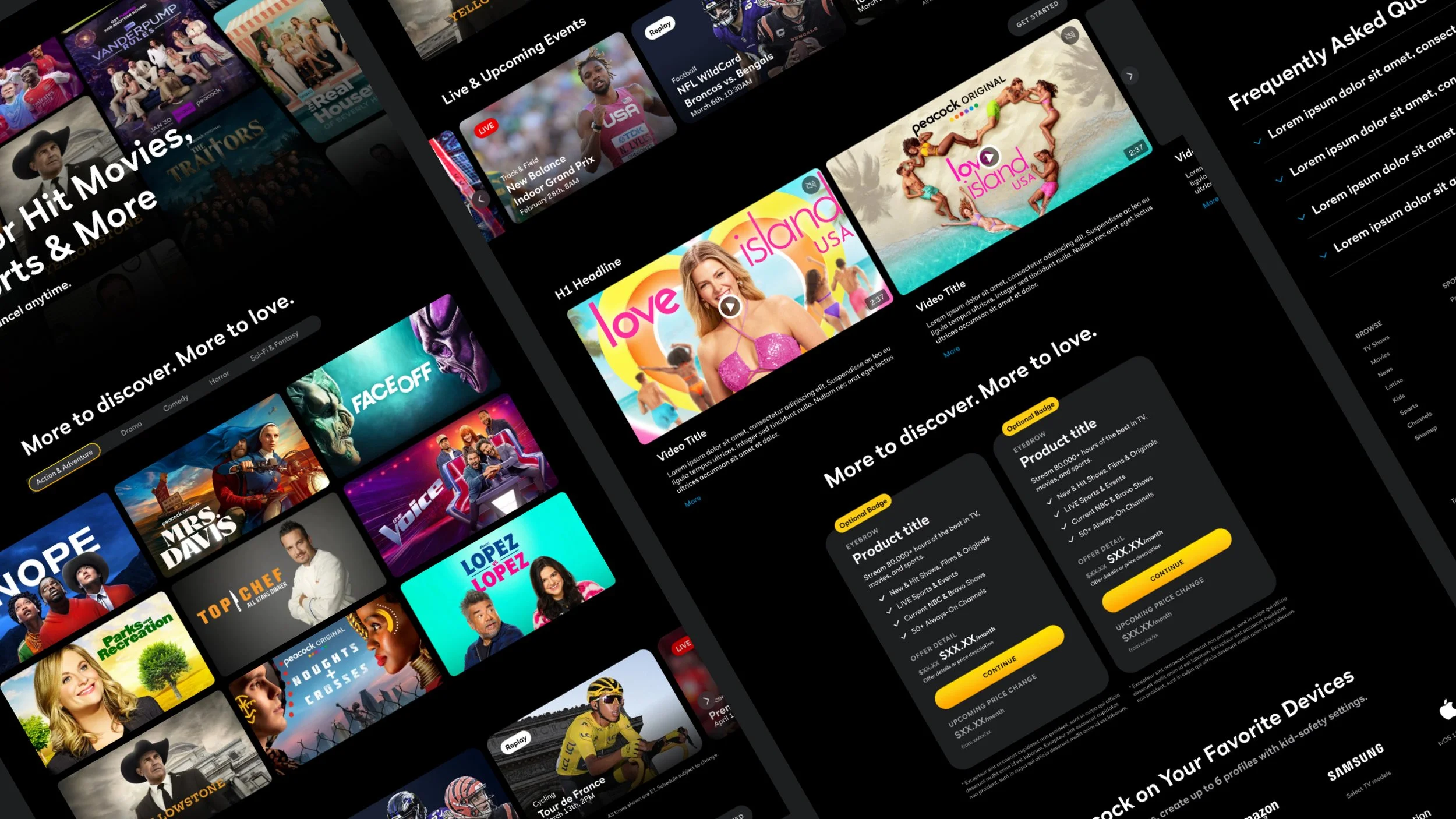
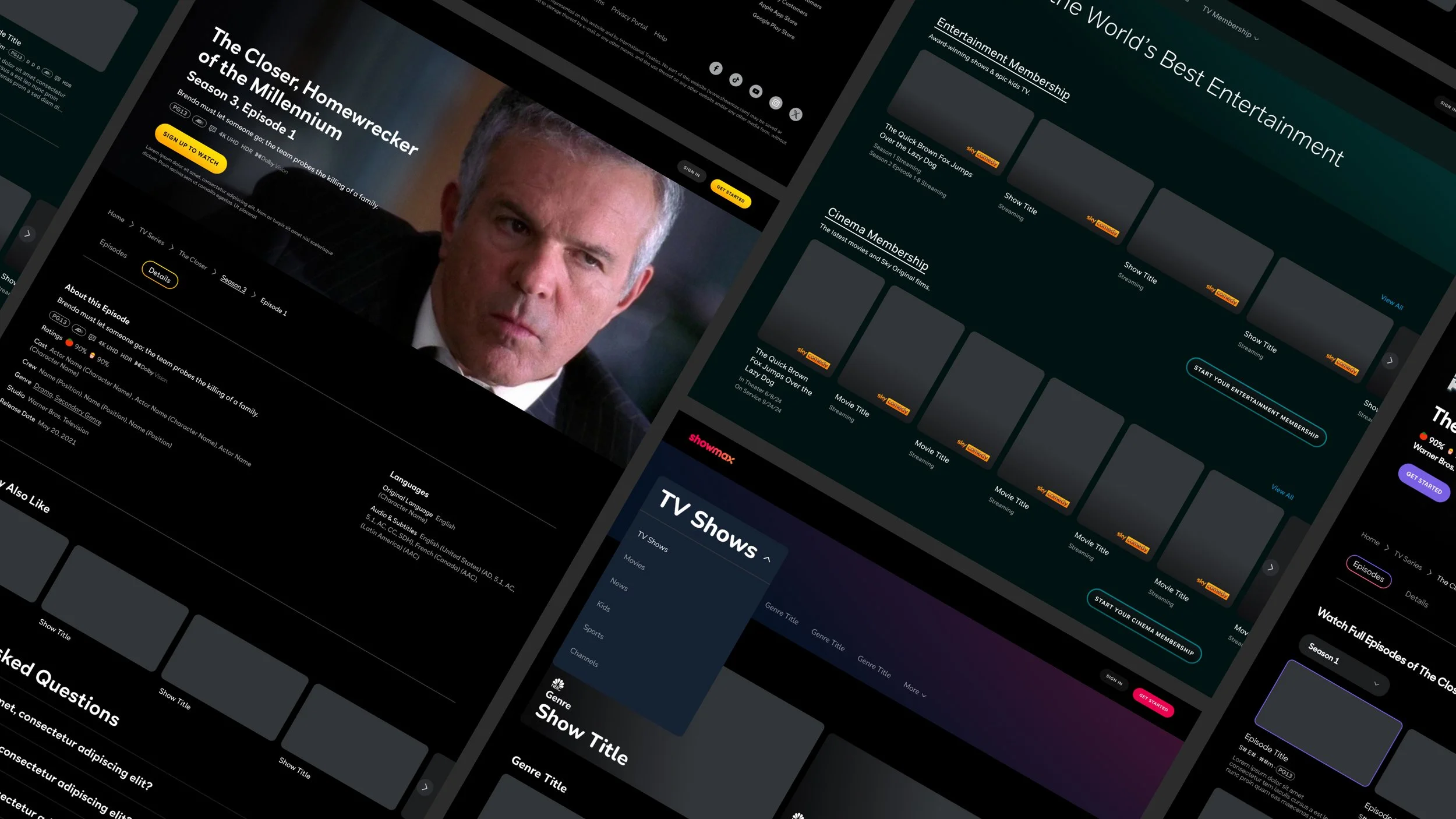
Building Blocks & Templates

Streamlining Content Creation for Global Brands
To support the needs of multiple brands, languages, and audiences, we focused on developing a set of adaptable templates. This was the central part of the project. These building block templates were designed to accommodate various requirements, including the need for longer languages like Dutch for SkyShowtime, ensuring a consistent look and feel across all platforms. We wanted to ensure that something that looked good in English for PeacockTV would work for extremely long languages. We started with over 20 different templates to meet the initial MVP requirements.
Prior to this, creating landing pages using the Iceberg CMS was time-consuming and extremely manual. Not only was the old CMS complex and honestly, extremely wonky, it was hard to keep everything organized and streamlined. Our editors found themselves met with bugs and had to make sacrifices on what they could build. We wanted to streamline the workflow for our editors and drastically reduce the time and effort required to publish content.
The introduction of these templates significantly improved efficiency. Editors no longer needed to build each page from scratch by adding individual sections and components. Instead, they could simply select a template from a dropdown menu within the CMS and add it to the page. The new system also allowed for easy duplication of sections across different territories, requiring only minor changes to languages, images, and currency.
This new approach resulted in a drastic reduction in the time it took to create a single landing page. What once took several days to complete could now be done in just a few hours, making the task of creating landing pages for a brand like Showmax with 44 territories a much more manageable process.

Guidelines for Template

Guidelines for Template

Template Backend Form
Design
Frontend, Backend, & Guidelines
Pieces of a New CMS
For each template in this project, we built three core components: the customer-facing frontend, the internal team-facing backend form, and comprehensive guidelines for our editors. Our templates varied from individual building blocks, like pop-up banners and video players, to complete programmatic page redesigns. More complex designs like the video player which was completely net-new in our CMS required longer design time. We needed provide indepth user flows, prototypes, and interactions depicting how the video player would function. While simpler templates like the pop-up banner was done more quickly as the user flow was much simpler.
For large-scale projects, such as the programmatic pages, we worked closely with the SEO and Growth Marketing teams. This ensured our landing pages were not only aesthetically pleasing but also optimized for search engines, leading to enhanced visibility and improved organic traffic.
By providing a new set of building blocks, we streamlined the CMS experience for our internal teams. This approach ensured design consistency, reduced page creation time, and minimized long-term maintenance. While the new backend system slightly reduced creative flexibility (e.g., for colors or sizes), this was a deliberate choice to simplify the process and guarantee adherence to our design system. We didn’t want brands creating new colors that weren’t in their brand guides or using text sizes that were too small for mobile. This helped teams without dedicated designers to focus on content and business decisions, freeing them from making design choices. Ultimately, this improved efficiency and ensured a cohesive, professional web experience. We also provided detailed documentation to guide users on the best practices for each template.
Developer Toolkit
Centralizing Design with Dev for a Unified Web Experience

As part of the CMS improvements, our team also began a significant initiative to integrate the design system's styles and components into a centralized developer toolkit. This was a crucial step in streamlining the workflow, allowing developers to easily select and use approved styles rather than manually searching for specific values within design files.
This improved system meant developers could now see that a background color was background/primary instead of an arbitrary hex code. This was a game-changer, especially when managing the complexity of four different brand identities, which previously could lead to inconsistent and unmanageable code. We wanted to significantly reduce the need for "hard-coding" in our development process. Previously, if a brand updated its colors or font styles, our developers faced a difficult and time-consuming task of finding and changing every instance of that specific code.
The benefits of this toolkit extended far beyond the CMS redesign. By implementing the centralized developer toolkit, we created a scalable and future-proof system. Now, any brand-wide design change can be updated in a single, central location. This change propagates automatically across all pages and components, eliminating the need for manual, site-wide code adjustments. It created a global standard for our entire web experience, making future projects much more efficient as well.
For example, when working on new account or checkout screens, designers could now provide clear, unified specs for developers. This not only improved our overall process but also significantly enhanced our working relationship with developers, as they no longer had to spend time "in the weeds" of our designs.

User Acceptance Testing (UAT) Process

UAT Progress

UAT Progress

UAT in Stable-Int Environment

Provide Feedback to Developers
Build & UAT
Tech Hand-off / Delivery
To ensure a smooth transition from design to development, we prioritized clear and comprehensive documentation. We meticulously marked up every screen to proactively address potential issues and reduce future bug tickets. During the development phase, we provided ongoing support by answering all developer questions directly in Figma and through ad-hoc calls.
User Acceptance Testing (UAT) & Deployment

Following the completion of each template by the development team, our team conducted a thorough UAT phase within a stable-integration environment.
How complex a template was resulted in the number of UAT rounds required. Simpler templates, like the FAQs, typically needed only one or two rounds of UAT, while more complex ones like the hero or video player templates could go through five or more rounds.
We organized all feedback into prioritized buckets and managed all follow-on tickets to ensure every key issue was addressed systematically before deployment. Some things we needed to decide was nice-to-haves rather than MVP.
Finalization and Adoption
We have initiated template adoption with data migration in our phased template rollout. Ongoing support and assistance was and is continued to be provided to all teams during this phase as well as any feedback regarding usage of the templates. We continue to improve these templates, after our users come back to us with requests. And again, the cycle continues with the team deciding prioritization and adding more follow-on tickets to the backlog.
Review
Learnings
One reflection on this project is the need for earlier feedback loops to avoid delays caused by late-stage requirements. While these additional features might be considered MVP, they can disrupt design timelines as they were not in the initial tickets or discussions. Additionally, we lack quantitative and qualitative testing for these modules, hindering our ability to measure their effectiveness domestically and internationally.