

Showmax Web Sign Up Flow
Showmax, a streaming service delivering content primarily to a Sub-Saharan African audience, wanted to improve their existing web plan picker and plan builder capabilities to address key usability and comprehension challenges to create a lift in web and mobile conversion rates for the product.

Overview
Ongoing Project (Delivery Pending October 2025)
Showmax wanted to optimize their web plan picker and plan builder capabilities to address common usability and comprehension challenges in an effort to improve web and companion web conversion rates and address key customer pain points.
Role
Co-Lead Product Designer
Brands & Territories
Showmax (Sub-saharan Africa)
Teammates
Josh Williams, Asha Isaac, Emily Hunt
Partner lead comprehensive UI/UX design and user flow
Create high-fidelity designs for African Territories (44 Markets)
Prototyping, wireframing, mockups, and data analysis
What I’m Doing
Issue
Problem 1. What was available? Clarity of Available Devices
The current plan-building experience was confusing for customers because it lacked clear comparison of device availability between different plans. Users were not only uncertain about what a "Mobile Only" plan meant but also unaware that some plans were exclusively available on mobile devices and could not be streamed on a TV. Customers wanted this critical information to be presented more clearly and upfront in the user journey.
Problem 2. How much did it cost? Bundle & Price Transparency
The bundle presentation was confusing to users because it was unclear that they were purchasing two separate plans rather than a one single plan. While the business define it as a bundle, it wasn’t truly one. The initial design lacked key details, failing to inform users that the Premier League plan was only available as “Mobile Only” plan.
Additionally, the pricing was not obvious enough, so customers didn't realize they were getting a significant discount by purchasing a bundle. They were also unaware of the major differences between the "All Devices" and "Mobile Only" plans.
Problem 3. How can people pay? Recurring vs. Non-Recurring Payments
Many Showmax customers in territories like Ghana and Kenya prefer using mobile payment options such as MTN Momo or M-Pesa over credit cards due to a lack of trust in traditional banking systems. These customers also favor one-time purchases over monthly recurring payments.
The previous design was problematic because it hid non-recurring payment options, creating a confusing and discouraging user experience. Furthermore, customers were unsure about their plan's expiration date, as the plan period was not clearly communicated, which deterred them from completing their purchase. We needed to provide a much clearer distinction between recurring Monthly plans and non-recurring Once-off plans to improve user confidence.
Problem 4. How can we fix this for mobile? Mobile Design Optimization
The current design was not optimized for mobile, which presented a significant barrier for Showmax’s users. For a large userbase across Africa, a smartphone is the primary and often only way to access the internet. This has led to a strong preference for using phones over desktop browsers for everything from browsing to making purchases. The design experience needed to be updated to a mobile-first approach. This change would make sure plan building experience was accessible, intuitive, and efficient on the devices customers use most.
Problem 5. Can we reuse this solution? Plan Picker Design Works for Props Outside of Showmax
We wanted to create a scalable and reusable solution that could be applied across other brands under the NBCUniversal umbrella so we could avoid a one-off design exclusively for Showmax.


Discovery
Stakeholder and Team Kick-Off
The design team met with both the internal product team and external Showmax stakeholders to align on the project's expectations and scope. It was critical to clarify that this was an optimization project, not a complete redesign of the existing sign-up flow and plan builder.
With a limited technical scope, our team's goal was to manage expectations upfront. We could significantly improve the frontend UI of the existing journey, but we could not add any completely net-new elements. To avoid simply making minor tweaks, we committed to delivering a comparable design elevation, ensuring a noticeable and valuable improvement within the given constraints.
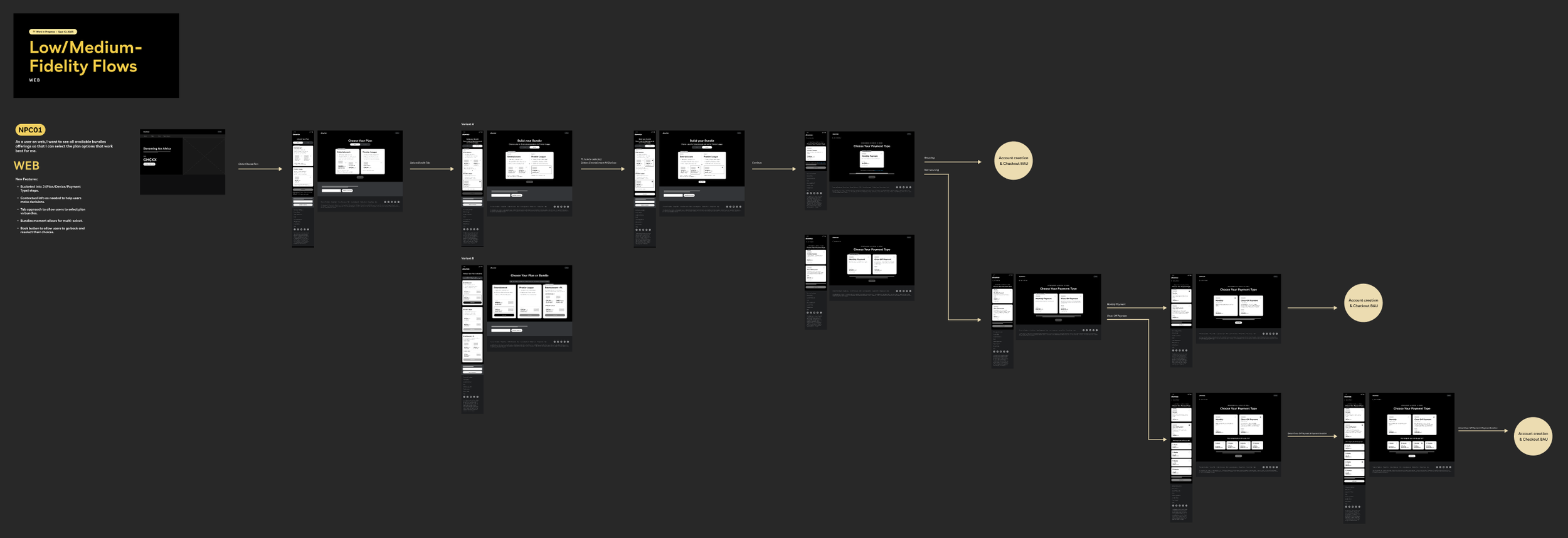
User Journey Mapping
We began by mapping and analyzing the different user journeys a customer could take to purchase a plan or create a bundle. We wanted to gain a clear understanding of the entire funnel, from the user's initial arrival on a landing page, to finding the plan picker, and ultimately completing the sign-up process.
We identified and focused on two primary flows: a new customer purchasing a single plan and a new customer purchasing a bundle. By deconstructing these specific journeys, we were able to find key areas of opportunity for optimization.


Discovery

Data Analysis
Based on existing research conducted by the Showmax team and our analysis of PeacockTV's plan pickers, we aimed to leverage these findings to estimate how we could improve the current web sign up journey for Showmax.
Competitive Analysis
Additionally, the team explored and examined our competitors’ sign up flows to better understand trends and patterns seen in a plan picking journey. While few streaming services offer a bundle creation journey, we found valuable insights into how they address price transparency.
We leveraged insights from this competitive analysis to understand industry best practices. This research was crucial for ensuring that our solutions not only addressed key user pain points but also made our pricing and plan details transparent, clear, and competitive.
Plan
Beginning: Research
The design and product teams kicked off this project by utilizing our research findings to drive our weekly discussions to evaluate and address key customer pain points within the existing sign-up journey. After thorough evaluation, we found that we wanted to solve these issues through more transparent design and by simplifying the plan-building process.
Middle: Ideation & Design Exploration
Following a thorough analysis of the existing user journey, we identified two primary areas for improvement: information visibility and user flow simplification. We explored and designed solutions to address both of these issues. For information visibility, we moved crucial details earlier in the journey, placing them directly within the plan picker cards. This allowed customers to make more informed decisions upfront. To simplify the user flow, we explored a more intuitive, multi-step sign-up process, making it easier for customers to understand and complete.
End: Review & Finalization
Following an internal review with our product partners and the Publishing Tools team, we presented our designs to the external Showmax stakeholders for their feedback. After several rounds of discussion with this team and our VPs, we reached a solution that all parties were happy with.
The Showmax team was particularly satisfied with the improved price transparency. They also provided valuable feedback rooted in their deep knowledge of the African market, giving us a better understanding of their users' specific preferences and needs. We've incorporated this feedback into the current designs.
We are scheduled to have a final review with our VPs at the end of September 2025 and a final review with the Showmax team in early October 2025, with the final delivery slated for October 2025.

Old Plan Picker

New Plan Picker (WIP)

Old Plan Builder

New Plan Builder (WIP)
Design
Plan Picker
Information Visibility
We made several major changes to the existing plan picker to address key user pain points described in the user research.
Bundle Presentation is Confusing and Inconsistent
The previous plan picker showed a "From" price, which only showed the cheapest option potentially making users feel tricked. The new plan picker design showed immediate and transparent pricing, including the ability to build and see the price of a bundle upfront. This allows users to see all their options and make a fully informed decision.
The Information on Available Devices is Unclear, Mobile Plan is Not Clearly Defined, It’s Not Obvious that Premier League is Only on Mobile
We also made it clearer that the Premier League plan was only available as a “Mobile Only” plan. With a single card within the plan picker card, users at a glance could see what was available for Premier League. Pricing and device availability are now displayed more obviously and transparently in the new designs as the information is now displayed immediately instead of further down in the journey.
Enhanced Interactivity and User Guidance
We added more intuitive interactions to guide users through the process. For example, plan cards now only become selectable after a user has made all necessary choices, such as selecting two separate plans within a bundle. Icons and additional information were also integrated into the plan picker cards to provide more context. Based on initial research, we knew users in African markets respond well to visuals, so we added them them to improve clarity.
Plan Builder
We also made several improvements to the existing plan builder, simplifying the user experience by making critical information more accessible and intuitive.
Non-Recurring Payments are Hidden
The previous design was problematic for key markets as it hid Once-Off Payment options behind a small line of copy at the bottom of the plan builder. While this approach was acceptable and even favored in countries like South Africa where recurring payments are preferred, it was a issue in markets such as Ghana and Kenya. In these regions, many customers prefer using mobile payment services like MTN Momo or M-Pesa for once-off purchases.
To better serve these customers, we updated the design to easily show and hide non-recurring payment options and plan to add a toggle within the backend form to do so. This information is now exposed upfront, and when a user selects a Once-Off Payment, the available non-recurring payment methods are clearly displayed. This change makes the payment process more transparent and aligns with the preferences of a crucial customer base.
Payment Type (Monthly vs. Once-Off) isn’t Explained Enough
Context was added within the plan builder cards to help define the difference between Monthly and Once-Off payments. The new cards now specify that Monthly plans are billed automatically each month, while Once-Off payments are a single upfront charge for a set number of months. We added the capability to add visuals directly into the cards. We wanted to make it clear to users that they could pay using their preferred mobile money services such as MTN Momo and MPesa.
We also added a new interaction. When a user selects a Once-Off payment card, the design now clearly displays all available non-recurring payment methods, making the options transparent and easy to find.
User Flow Simplification
Build
This project is currently ongoing. Delivery will be finalized in October 2025.